
ARTSPER(BRANDING & EDITORIAL)

Branding — Design
Art Direction
Brand Identity
Spatial Concept
Graphic Design
Merch
Creative Direction
Photography & Film
Social Content
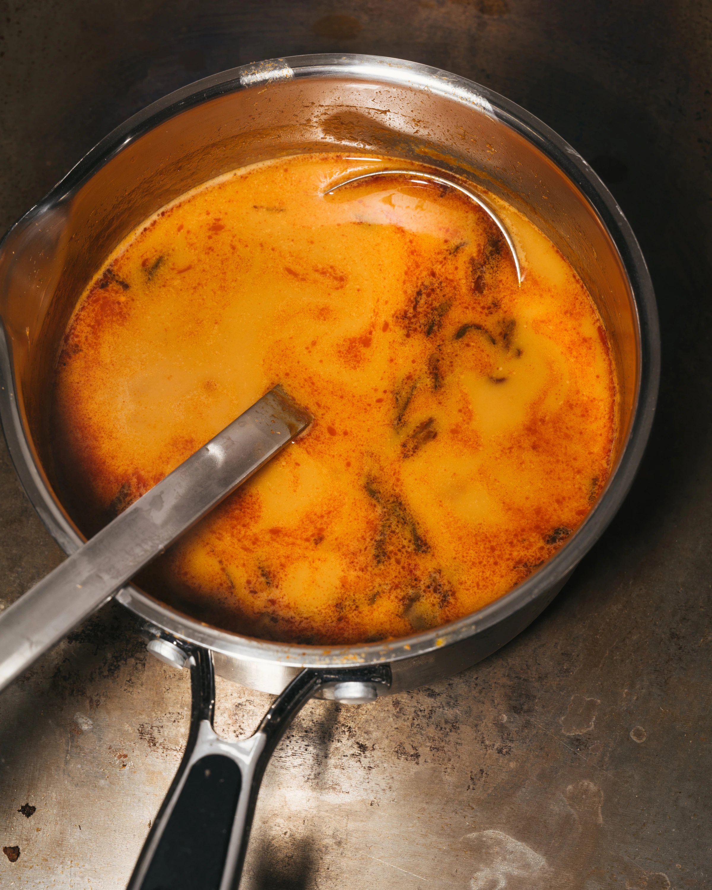
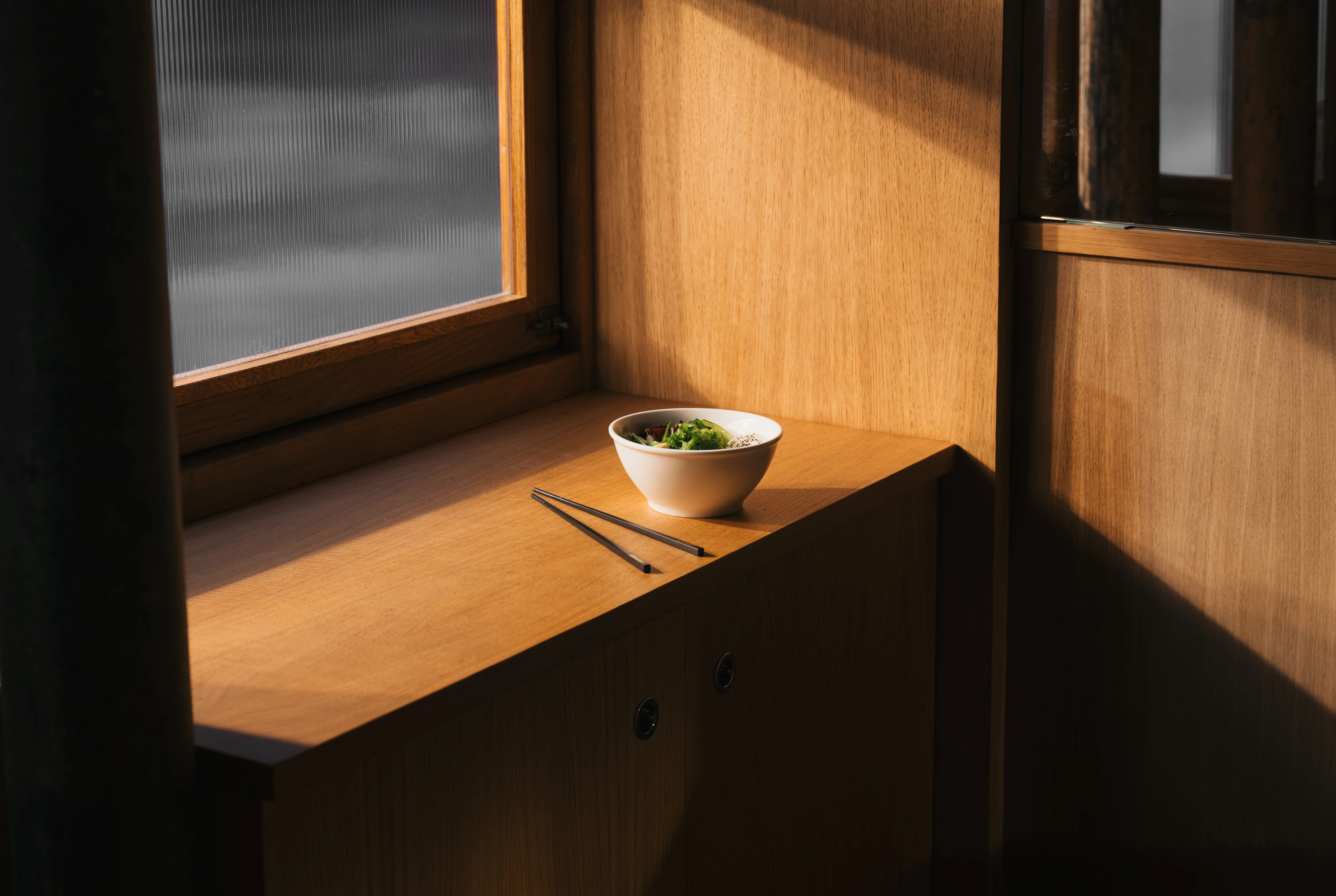
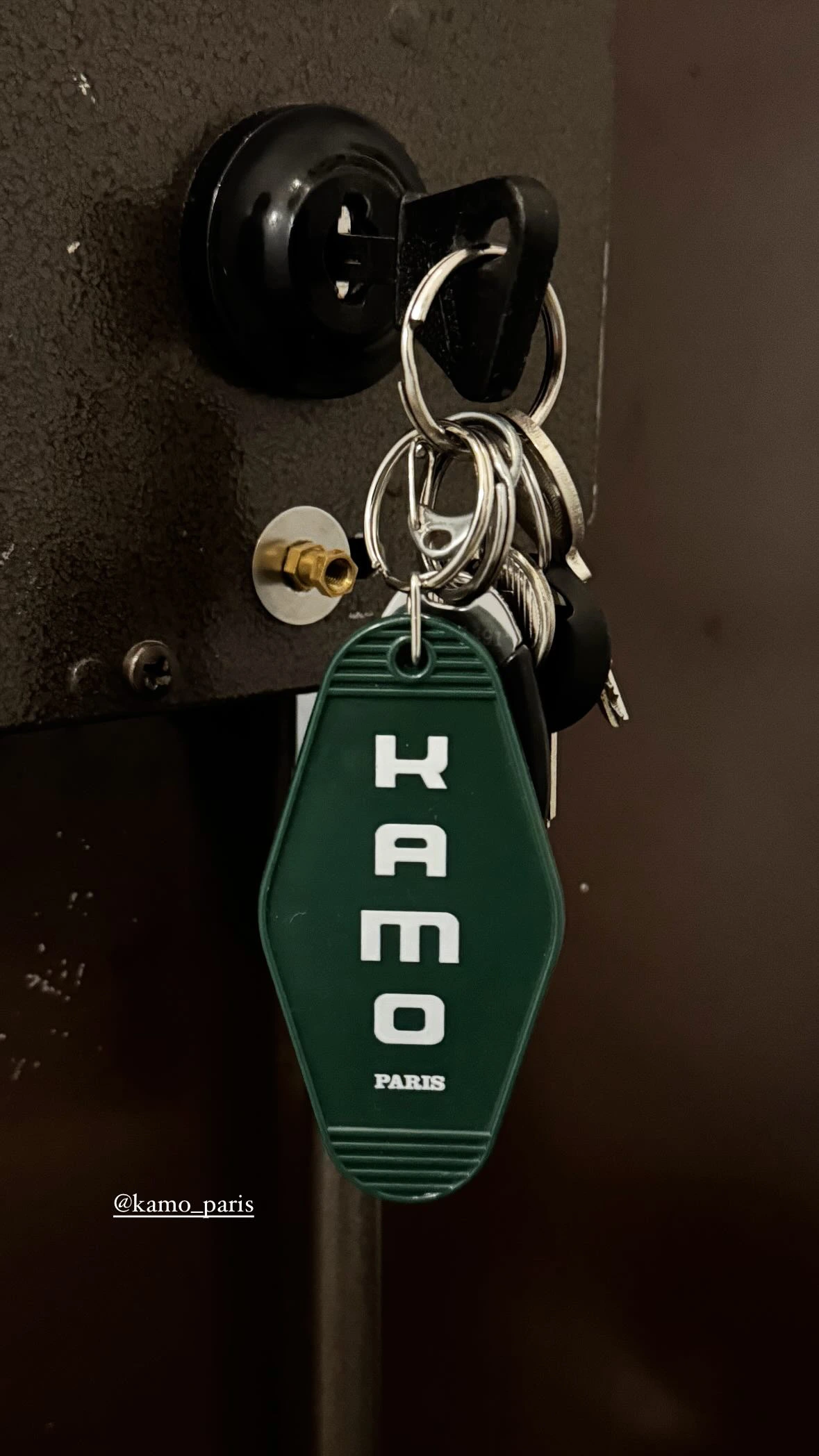
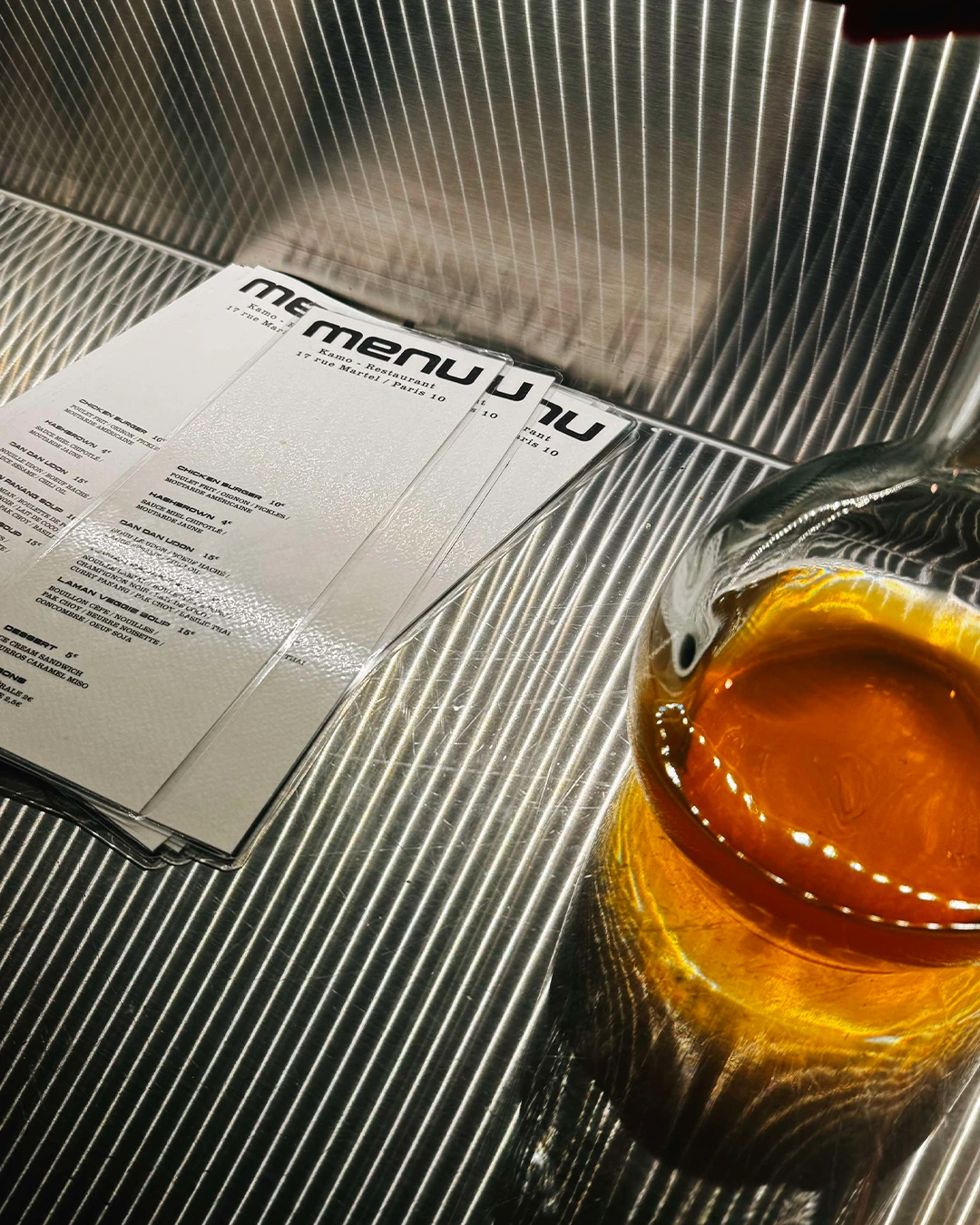
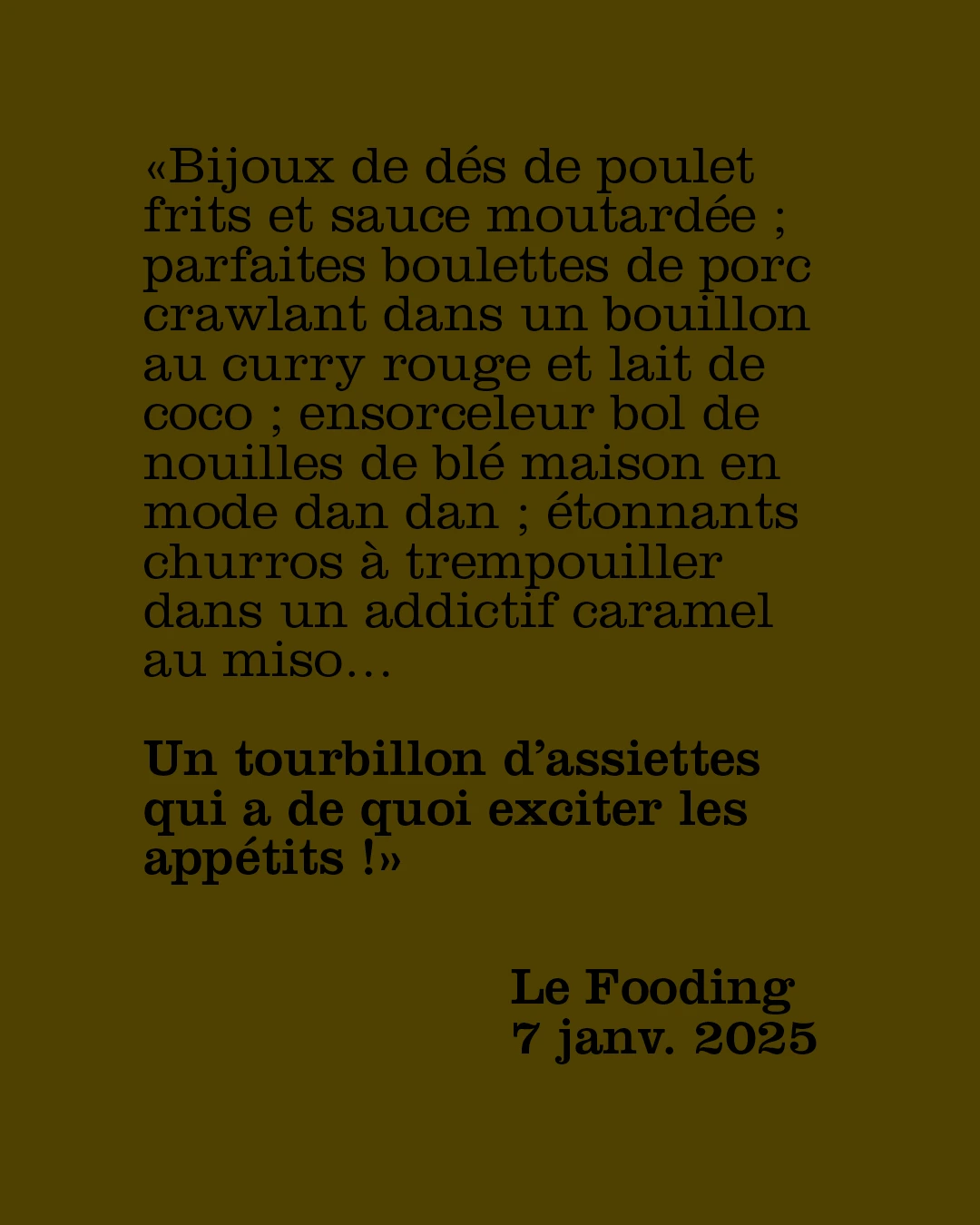
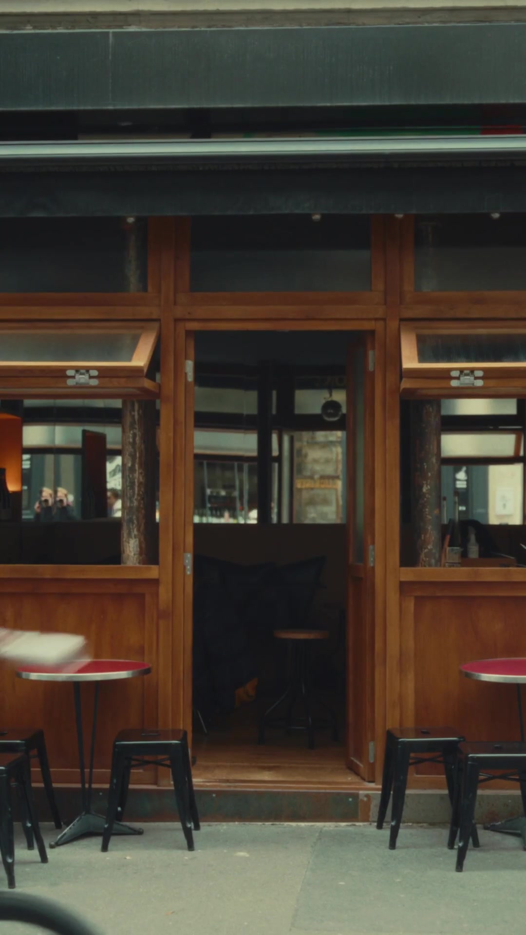
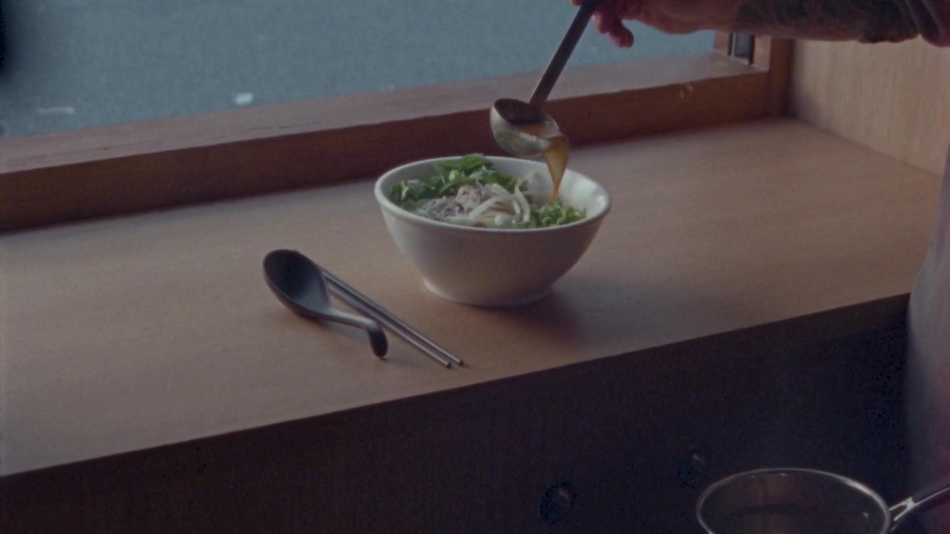
After the success of Tempête, the team opened Kamo in Paris. French-Japanese cooking, wines from the Jura and churros with miso caramel made for a place that was hard to put in a box.
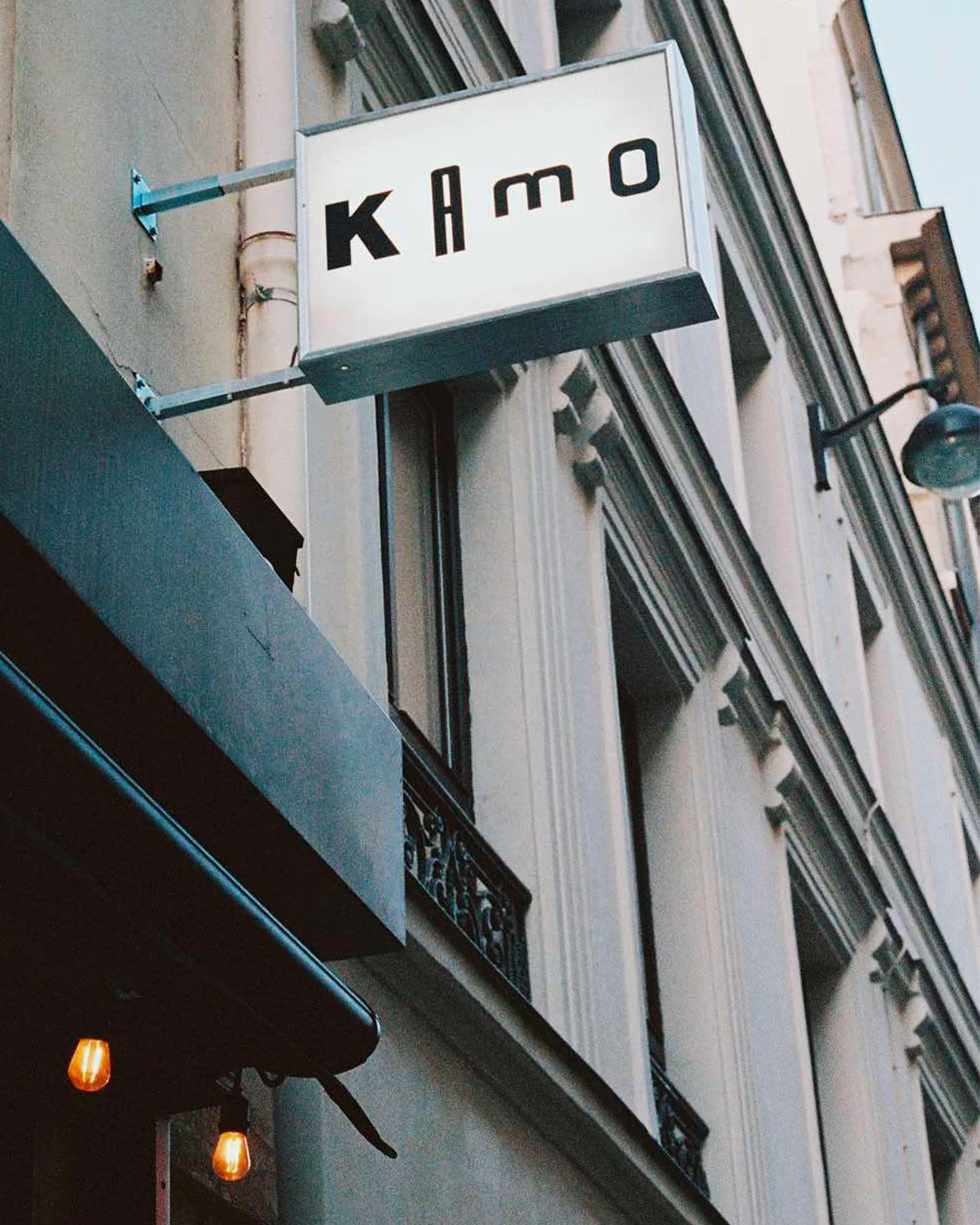
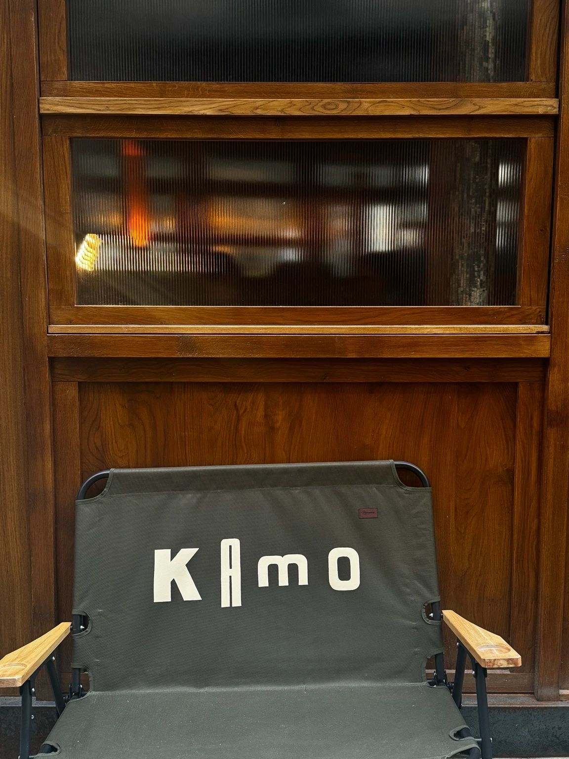
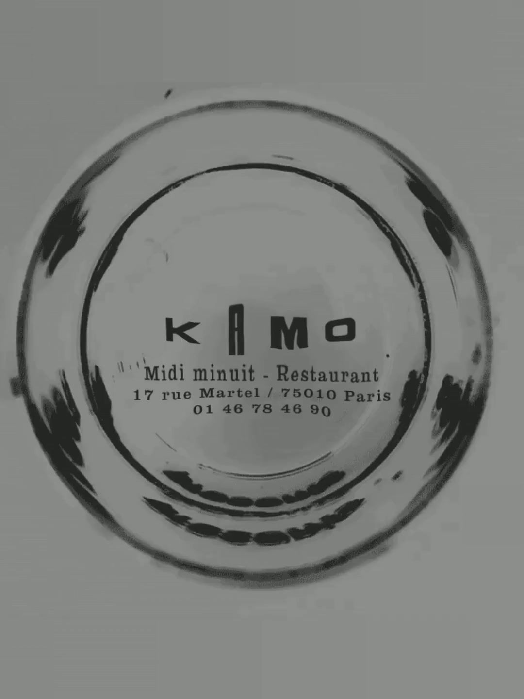
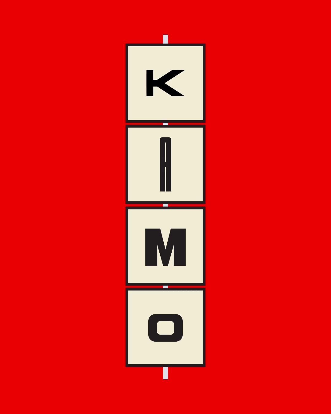
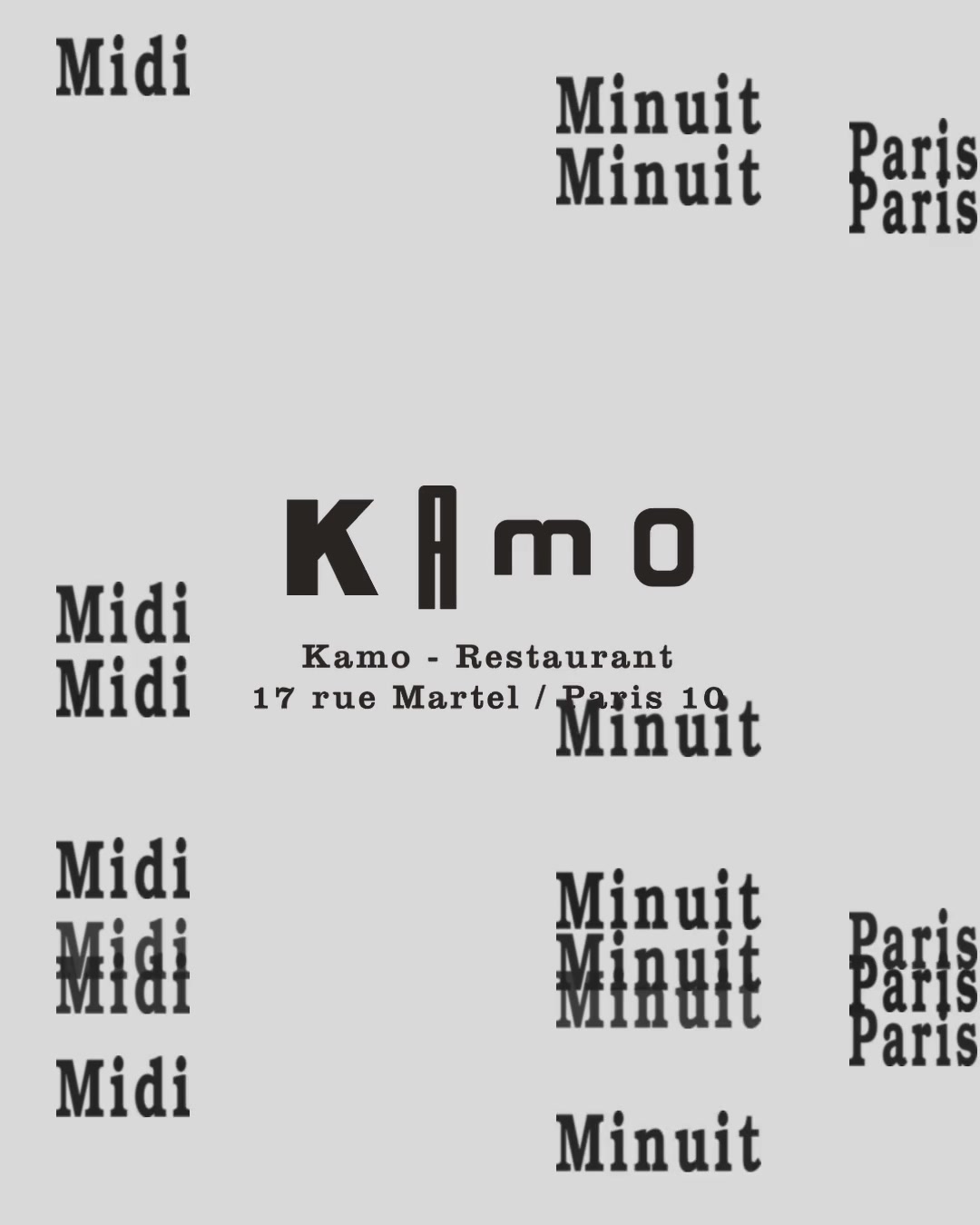
The team did things their own way, and we wanted the identity to have that same freedom. We took our cues from alphabet blocks and horizontal shop signs in Japan and Central Asia.



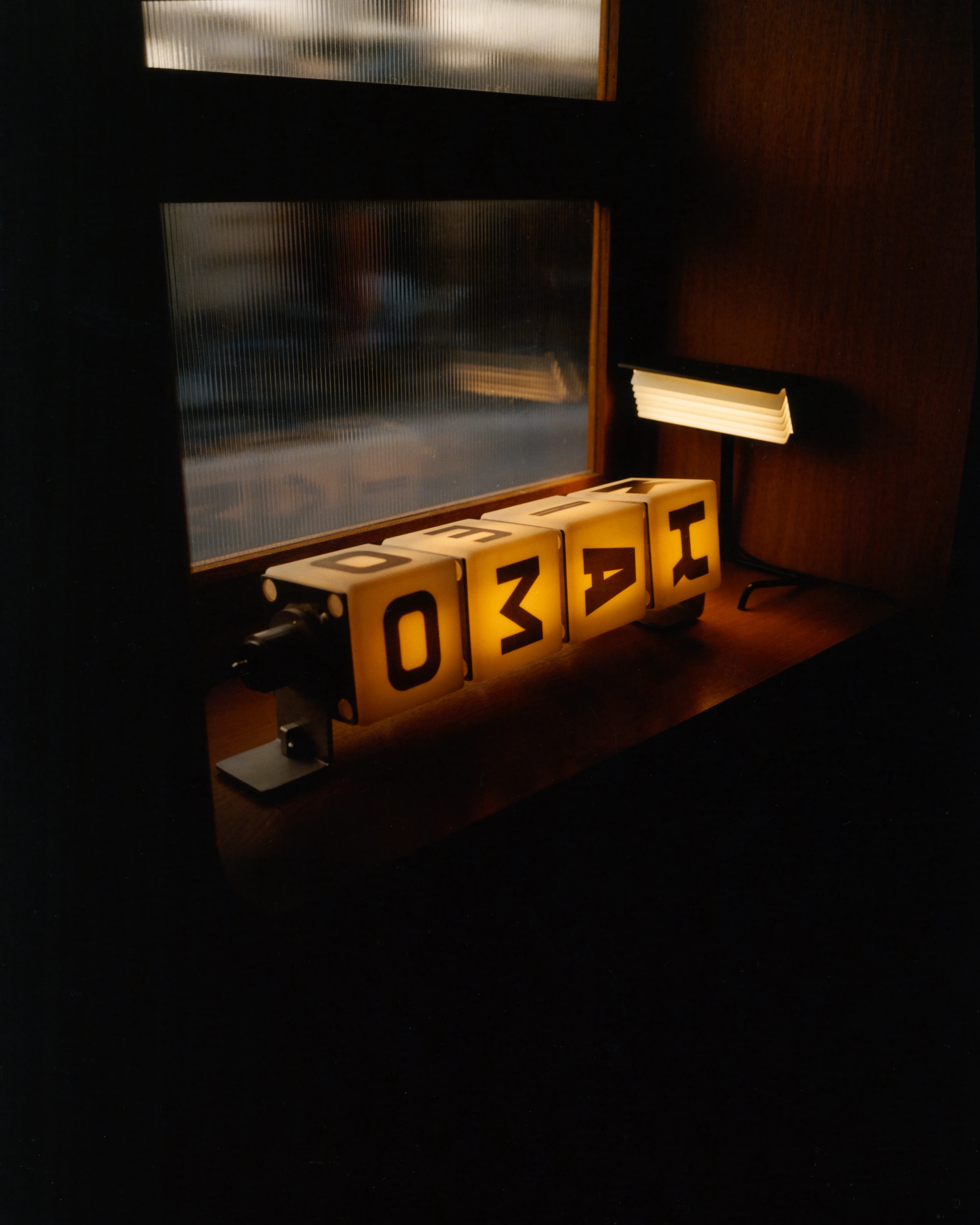
We designed an illuminated sign with four rotating cubes, one for each letter in KAMO. Each cube carries its letter in four different typefaces. Turn a cube and the wordmark changes. In the dim interior, the sign is something you can play with.
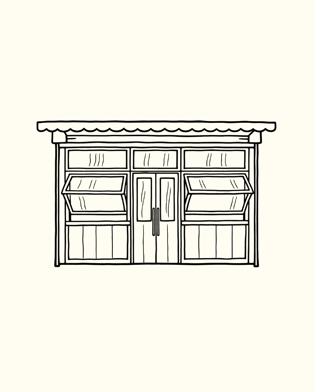
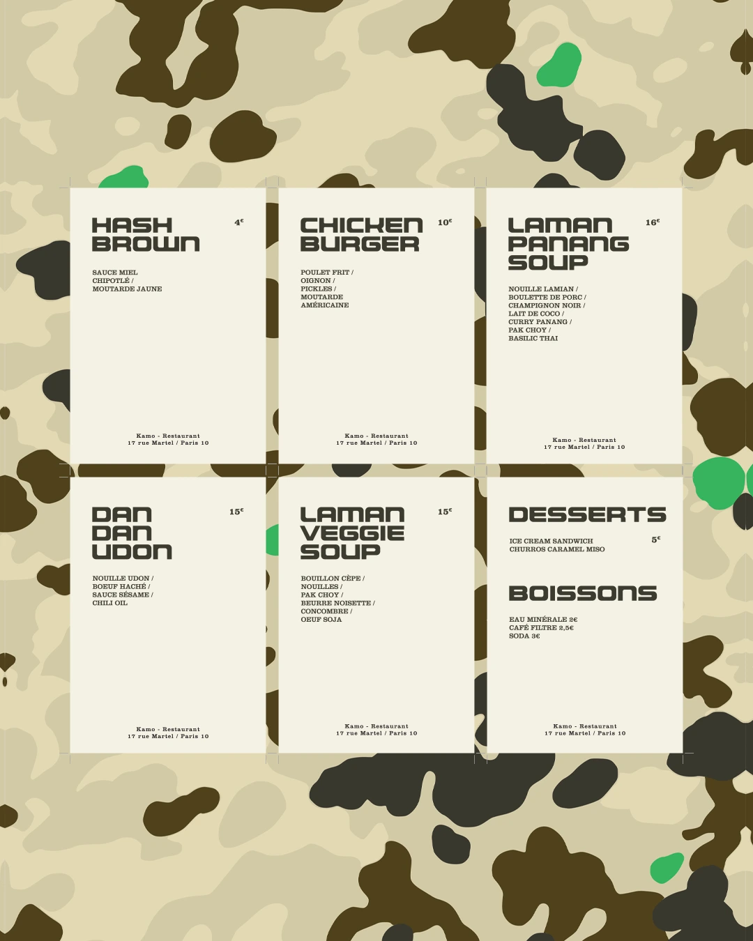
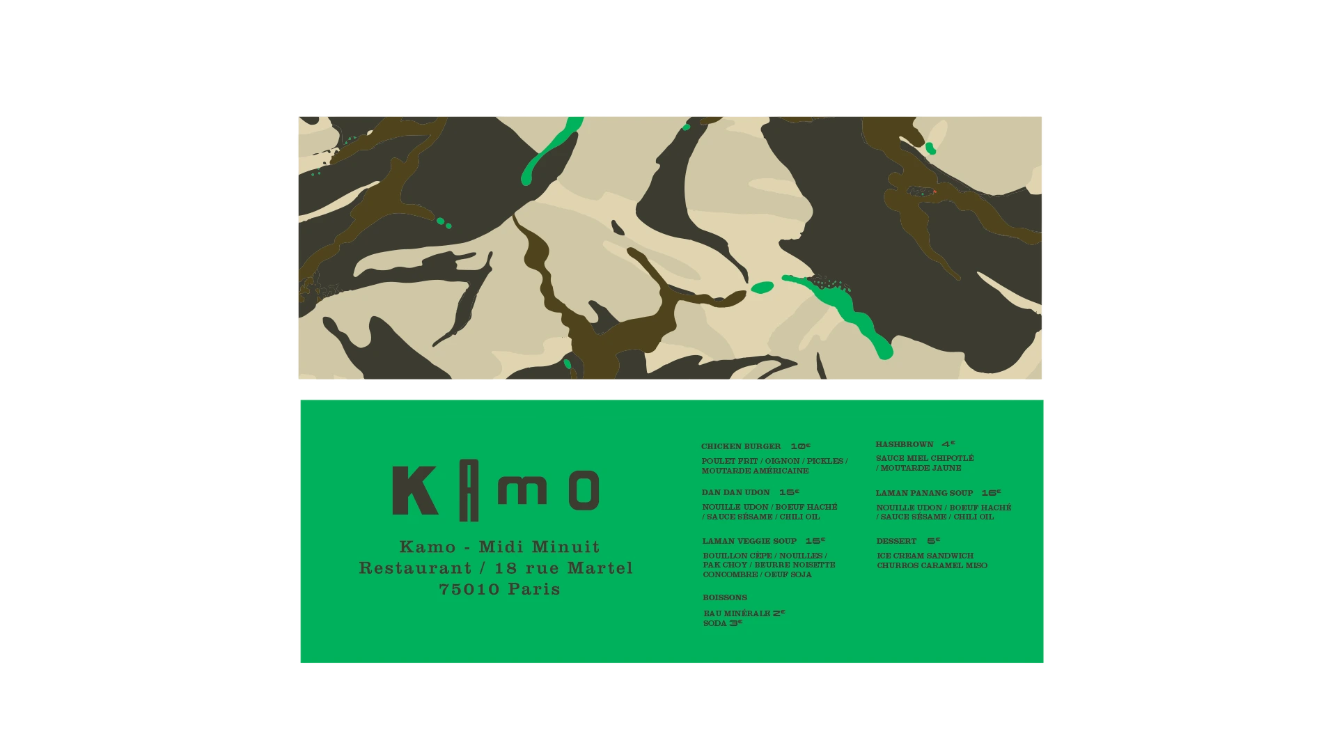
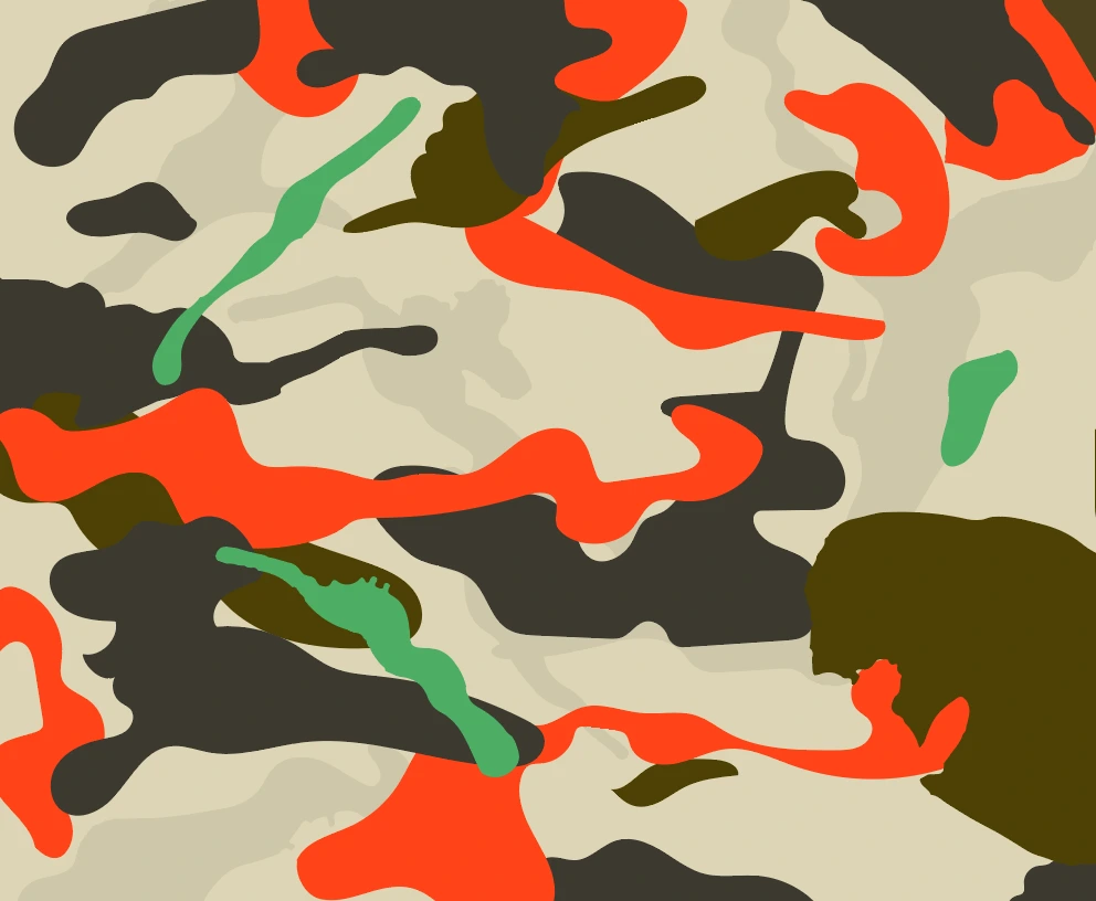
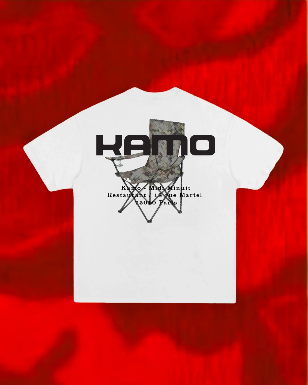
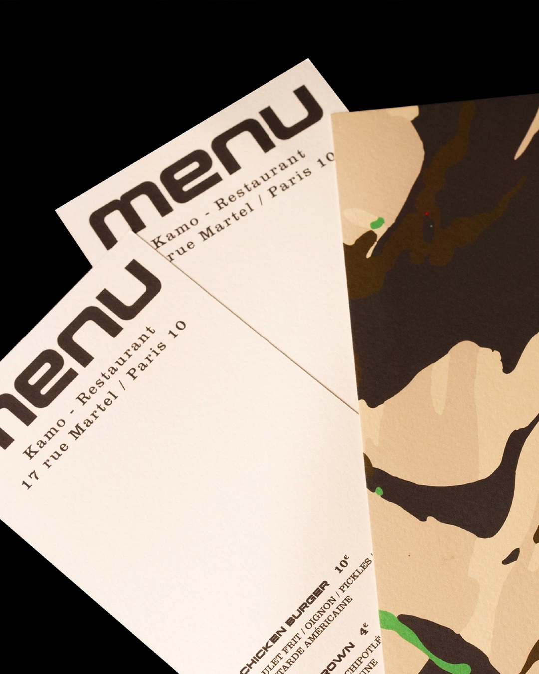
We also designed a series of camouflage patterns to dress the wordmark. The restaurant itself played with the same idea. Once closed, its discreet frontage blended into the street.
Émile Dévoit Proust
Pierre-Olivier Guillet
Émile Dévoit Proust
Fabien Voileau
Pierre-Olivier Guillet / Fabien Voileau
Sam Richon