Design

Milos Display, our own type.

Design

Type Design

Graphic Design

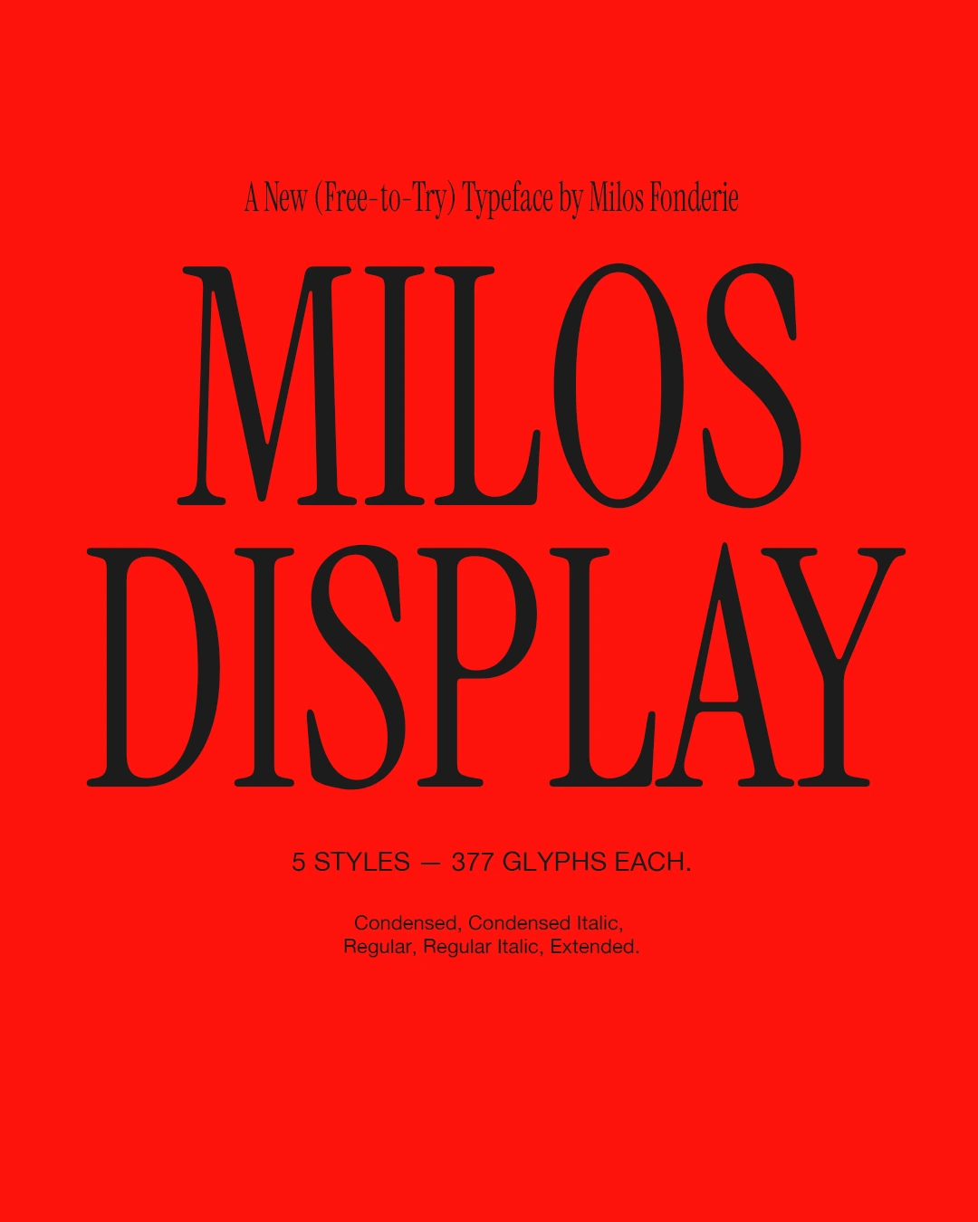
Red poster introducing the Milos Display typeface
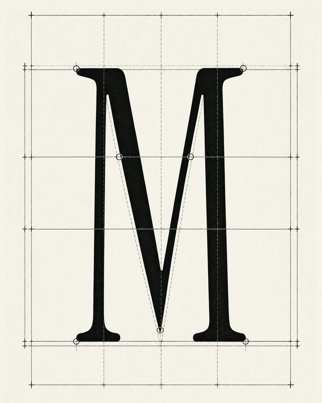
Construction grid for the Milos Display capital M
Red poster introducing the Milos Display typeface
Construction grid for the Milos Display capital M

Why a Typeface?

We give brands their own type. It felt only right to launch Milos with our own.

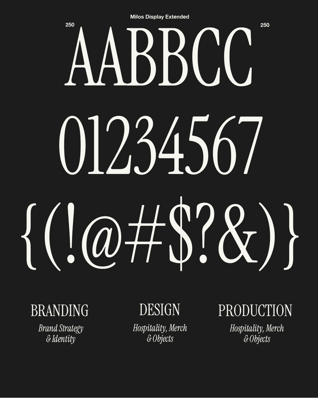
Milos Display brings the elegance of old-style serifs into a contemporary, expressive design made for large sizes. It explores the meeting point between book typography and advertising, giving words a strong presence on the page.

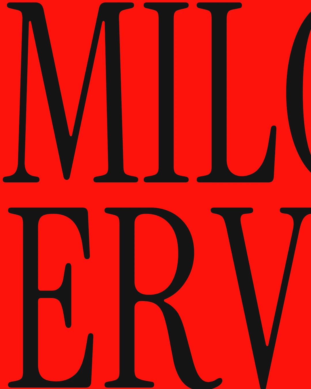
Oversized Milos Display letterforms cropped on a red poster
Egg-shaped lamp glowing among books and toys on a shelf
Uppercase and lowercase A in Milos Display
Egg-shaped lamp glowing among books and toys on a shelf
Uppercase and lowercase A in Milos Display

Type Design and Specimens

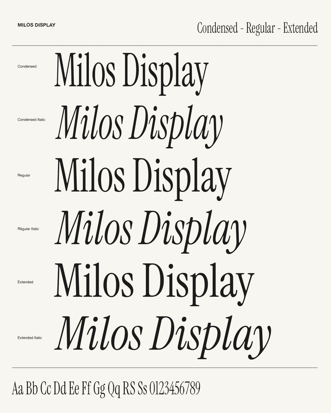
High contrast, flowing curves and bracketed serifs balance tension with softness. Calligraphic lowercase forms and expressive italics bring movement to the page.

Three widths—Condensed, Regular,Extended—shift the rhythm from compact and vertical to open and expansive.

We introduced it on Instagram with a playful invitation: “comment GIMME THE FONT and we’ll send it over.”

Milos Display type specimen comparing six styles
Milos Display specimen showing letters, numerals and punctuation
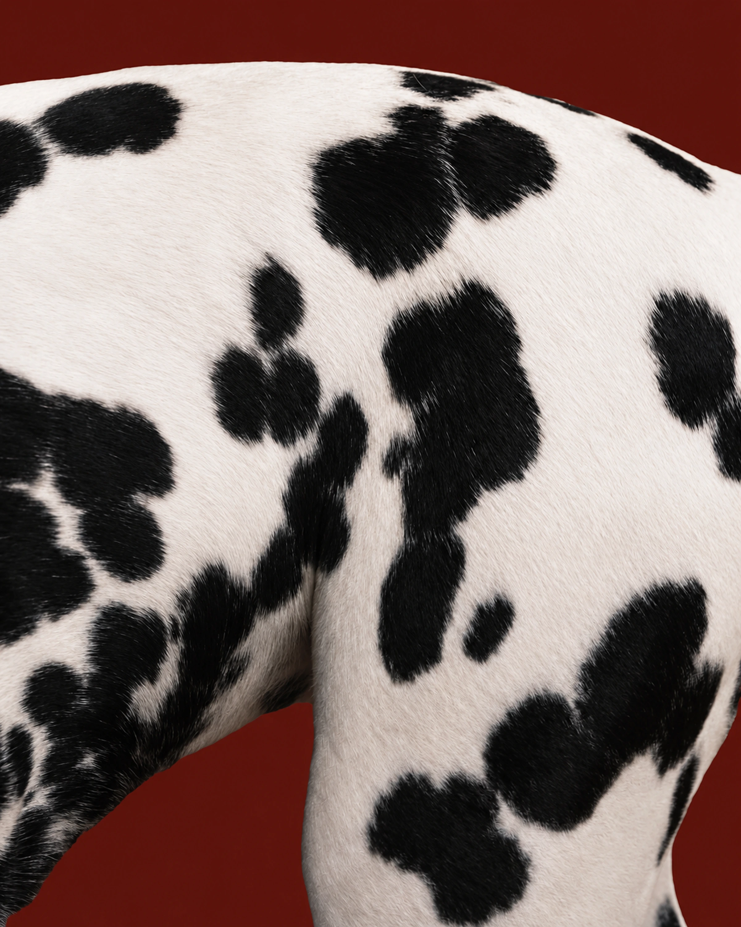
Black-and-white spotted graphic against red
Milos Display type specimen comparing six styles
Milos Display specimen showing letters, numerals and punctuation
Black-and-white spotted graphic against red

AaBbCcDdEeFfGgHhIiJjKkLlMmNnOoPpQqRrSsTtWwXxYyZz
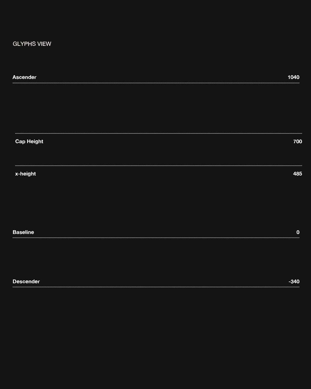
Dark type specimen with horizontal guides

AaBbCcDdEeFfGgHhIiJjKkLlMmNnOoPpQqRrSsTtWwXxYyZz
Dark type specimen with horizontal guides
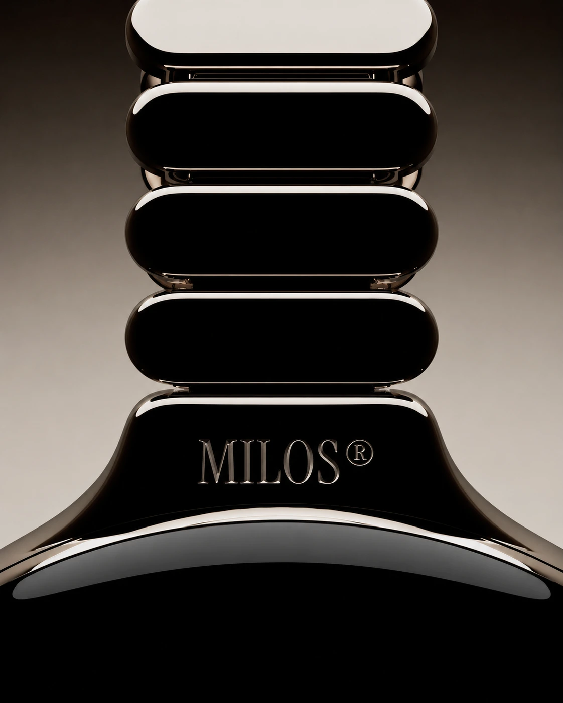
Sculptural black totem bearing the Milos signature
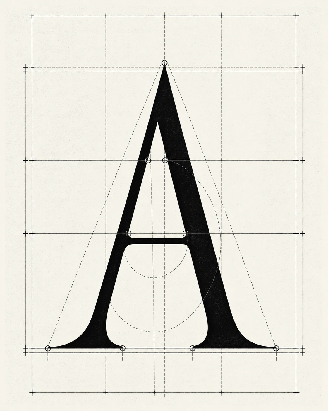
Construction grid for the Milos Display capital A
Sculptural black totem bearing the Milos signature
Construction grid for the Milos Display capital A
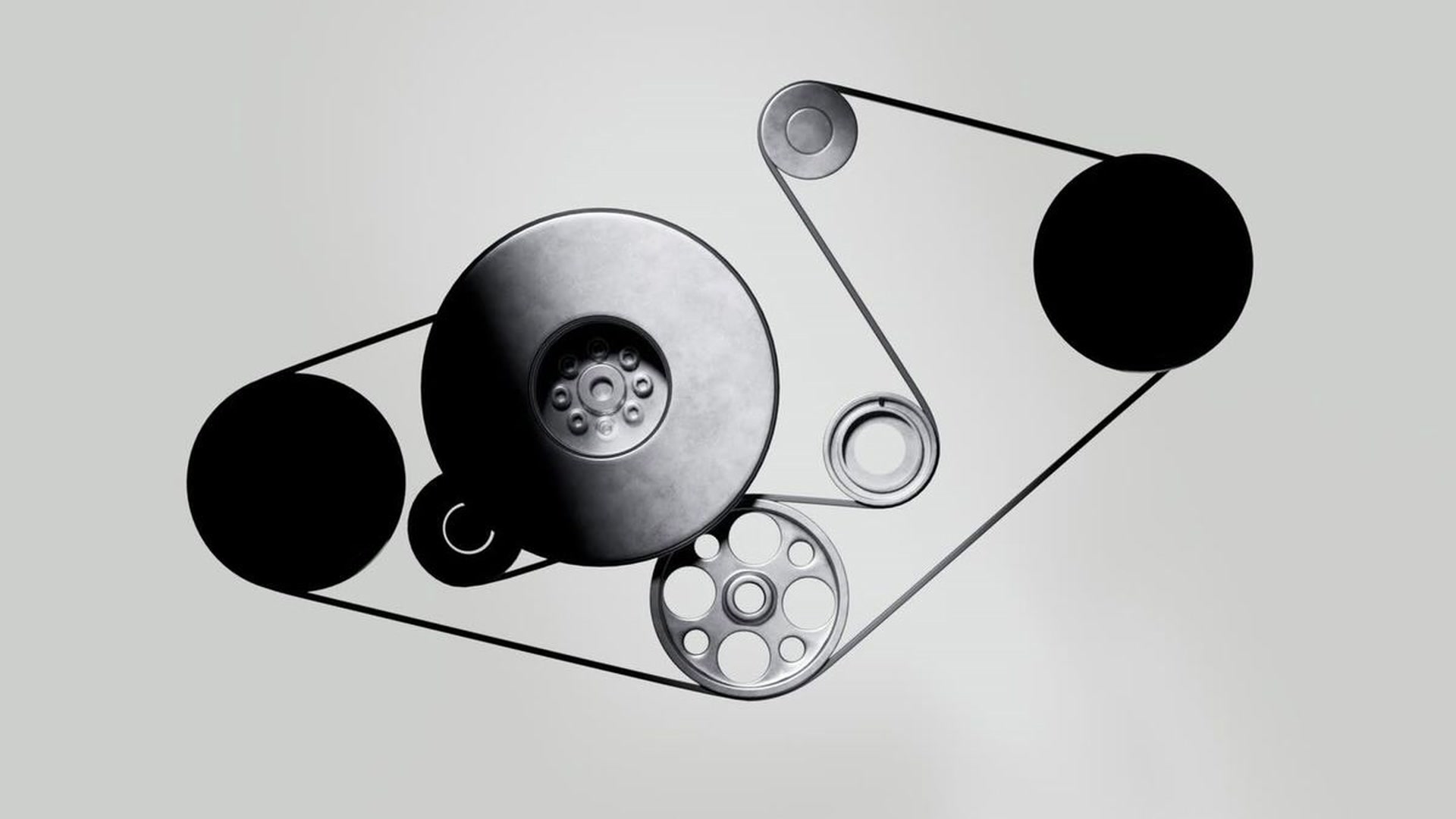
A mechanism of pulleys and belts rendered in black and silver
M.T.F. 75 lettering flanking a metallic dragon emblem
A mechanism of pulleys and belts rendered in black and silver
M.T.F. 75 lettering flanking a metallic dragon emblem

Credits

Creative Direction

Émile Dévoit Proust / Grégoire Tignol

Type Design

Émile Dévoit Proust

AD & Graphic Design

Émile Dévoit Proust

Motion Design

Émile Dévoit Proust

More projects